Creating a book cover is an important step in the publishing process. The cover is the first thing that potential readers will see and it plays a crucial role in attracting their attention and enticing them to pick up the book. Here are some tips for creating an effective book cover:
- Understand your audience: Before you start designing your cover, it’s important to understand who your target audience is. This will help you make design choices that will appeal to them.
- Choose the right image: The cover should include an image that is relevant to the story and that will resonate with the target audience. This could be a photo, illustration, or graphic.
- Use typography effectively: The typography you choose for the cover should be easy to read and should complement the image. The title and author name should be prominently displayed.
- Use color effectively: The color scheme of the cover should be consistent with the tone and mood of the story. Bright colors can be used to attract attention, while more muted colors can create a more serious or contemplative mood.
- Keep it simple: A cluttered or overly busy cover can be overwhelming and off-putting to potential readers. Keep the design simple and easy to read.
- Get feedback: Once you have a design, it’s important to get feedback from others. Ask friends, family members, and beta readers what they think of the cover, and take their feedback into consideration when making revisions.
- Professional help: If you’re not comfortable creating your own cover, consider hiring a professional designer. A professional can help create a cover that will stand out and attract readers.
- Dimension: Keep in mind the dimension of the cover as it will vary with the format of the book, for example, a hardcover book and an ebook will have different dimensions.
- Format: Consider the format of the book, whether it’s a print or an e-book. If it’s an e-book, the cover will have to be optimized for the different screens and devices on which it will be viewed.
Creating a great book cover takes time and effort, but it’s worth it in the end.
A well-designed cover can help attract readers and make your book stand out in a crowded market.
Here are a few examples of book covers that effectively use the tips outlined above:
- “The Hunger Games” by Suzanne Collins: This cover effectively uses a relevant image (a mockingjay pin) that resonates with the target audience and the story. The typography is simple and easy to read, and the color scheme is consistent with the tone of the story.
- “To Kill a Mockingbird” by Harper Lee: The cover of this classic novel uses an image of a tree with a tire swing hanging from it, which is relevant to the story and creates a mood that is consistent with the tone of the novel. The typography is simple and easy to read.
- “Harry Potter and the Sorcerer’s Stone” by J.K. Rowling: This cover uses an image of the Hogwarts castle, which is relevant to the story and creates a mood that is consistent with the tone of the novel.
- “The Girl on the Train” by Paula Hawkins: This cover uses a simple and effective image of a train with a silhouette of a woman looking out the window, which is relevant to the story and creates a mood that is consistent with the tone of the novel. The title and author name are prominently displayed in a clear and easy-to-read typography.
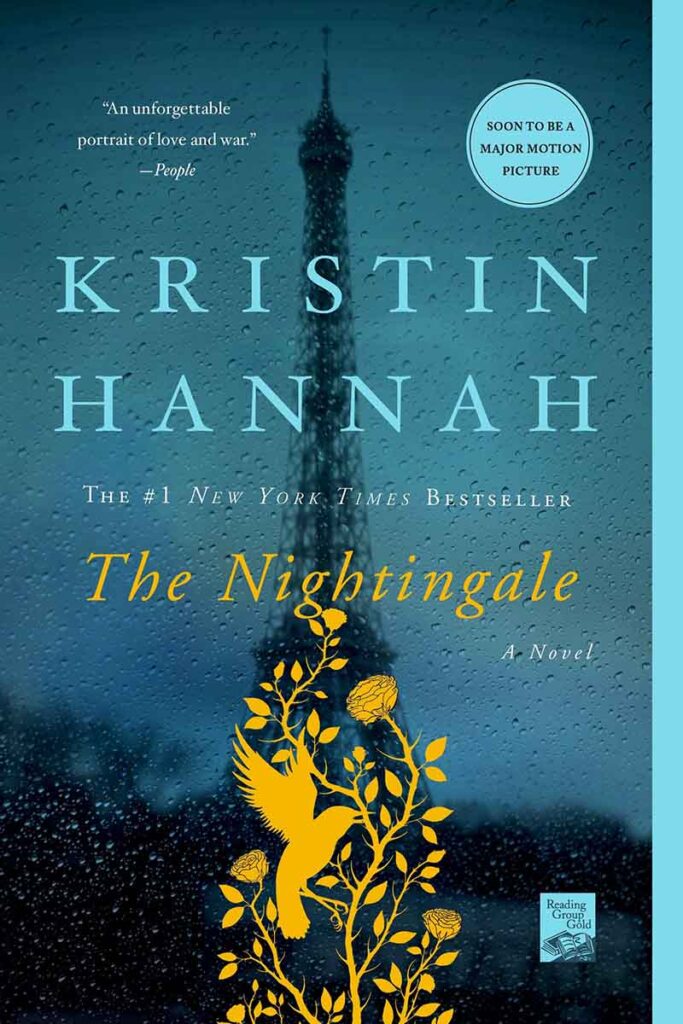
- “The Nightingale” by Kristin Hannah: This cover uses a simple but powerful image of a nightingale, which creates a mood that is consistent with the tone of the novel. The title and author name are prominently displayed in a clear and easy-to-read typography.
These examples show how a well-designed cover can effectively use images, typography, color, and simplicity to attract readers and make a book stand out in a crowded market.


